best react component libraries: Top picks for 2025
Discover the best react component libraries to boost your 2025 projects. This concise guide reviews top options and use cases to help you pick quickly.

Selecting the right component library is a foundational decision for any React project. It dictates not just the look and feel of your application but also its performance, accessibility, and long-term maintainability. The wrong choice can lead to frustrating development cycles, performance bottlenecks, and a user interface that fails to meet user expectations. This decision significantly influences how quickly you can build an MVP or scale an existing product. By leveraging pre-built solutions like component libraries, development teams can also find effective strategies to reduce software development costs and improve overall project efficiency.
This guide is designed to help you navigate this critical choice. We’ve analyzed the 12 best React component libraries available today, from comprehensive UI kits like MUI and Ant Design to flexible headless options such as Radix UI and Headless UI. Our goal is to provide a clear, practical comparison to help you find the perfect fit for your specific project needs, whether you're building a quick prototype, an enterprise-level dashboard, or a highly customized design system.
Inside, you'll find a detailed breakdown of each library, complete with an honest assessment of its strengths and weaknesses, ideal use cases, and essential technical details like bundle size and TypeScript support. We’ll look at real-world implementation considerations and provide the information you need to select a library that empowers your team to build better applications, faster. Let's dive in and find the tools that will set your project up for success.
1. MUI: The Enterprise-Grade Powerhouse
MUI stands out as one of the best React component libraries for building sophisticated, enterprise-level applications. It offers a massive, well-documented suite of components based on Google's Material Design, providing a solid foundation for complex user interfaces. Its strength lies in its comprehensive ecosystem, which goes beyond standard UI elements.
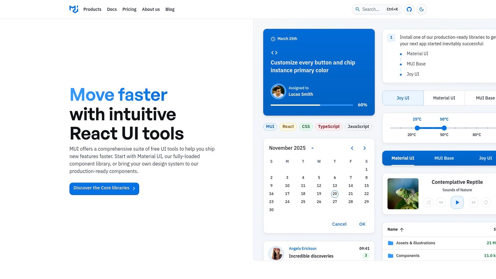
The library is structured into a free open-source core (MUI Core) and a commercial tier called MUI X. This premium tier provides advanced components like a high-performance data grid, charting tools, and complex date/time pickers, which are essential for data-rich applications. This dual-license model allows teams to start for free and scale to powerful, professionally supported features as their needs grow. For teams looking to implement such a robust system, professional React development services can streamline the integration process.
Key Details & Use Cases
| Aspect | Details |
|---|---|
| Best For | Enterprise applications, complex dashboards, data-heavy SaaS platforms, and projects requiring a mature, well-supported design system. |
| Strengths | Extensive Component Set: A vast collection of mature and well-documented components. MUI X for Data: Powerful, commercially supported components for data grids and charts. Customization: Deep theming capabilities allow for extensive brand alignment. Community: Large, active community and frequent updates ensure reliability. |
| Limitations | Paid Features: The most advanced components (Data Grid, Charts) require a commercial license. Learning Curve: The extensive theming system can be complex for beginners to master fully. |
| Pricing & License | Core components are free under the MIT License. MUI X components require a Pro or Premium commercial license, starting at $15 per developer/month. |
Website: https://mui.com
2. Ant Design: The Enterprise-Ready UI Framework
Ant Design, often called AntD, is an enterprise-class UI design language and React library. It is renowned for its comprehensive set of high-quality components and a polished, consistent design philosophy, making it one of the best React component libraries for building sophisticated internal dashboards, back-office systems, and data-rich web applications. Its TypeScript-first approach ensures type safety and a superior developer experience.
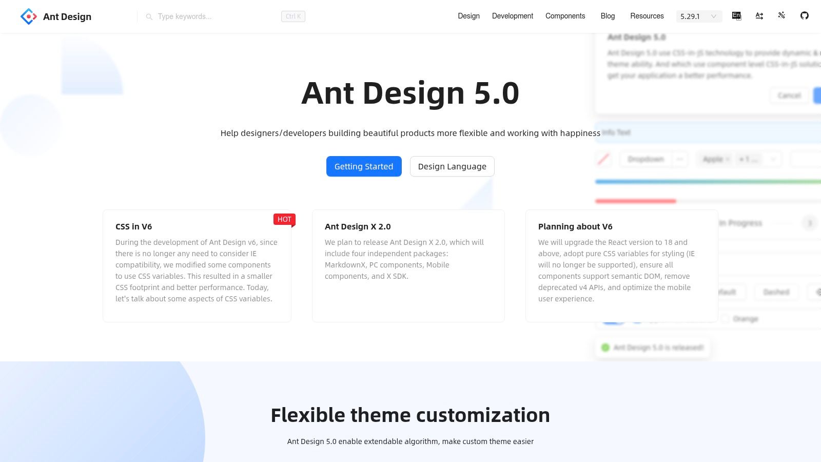
The library provides a vast collection of components that feel cohesive and work seamlessly together right out of the box. AntD's strength is its focus on creating a predictable and efficient user experience for enterprise software. It offers robust solutions for complex scenarios like data entry, visualization, and navigation, supported by excellent documentation and design resources that help teams build beautiful and functional applications quickly.
Key Details & Use Cases
| Aspect | Details |
|---|---|
| Best For | B2B applications, administrative dashboards, complex forms, data management systems, and any project that needs a comprehensive and consistent UI kit. |
| Strengths | Massive Component Library: Includes a huge selection of components for almost any need. Excellent for Data: Powerful table, form, and data visualization components. Great Documentation: Clear, interactive documentation with code examples. Internationalization: Built-in support for dozens of languages, making it ideal for global applications. |
| Limitations | Opinionated Design: The strong, distinct aesthetic can be difficult to override for extensive brand customization. Bundle Size: Its comprehensive nature can lead to a larger bundle size if not managed carefully with tree-shaking. |
| Pricing & License | Completely free and open-source under the MIT License. |
Website: https://ant.design
3. Chakra UI: The Accessible & Developer-Friendly Choice
Chakra UI has earned its place among the best React component libraries by prioritizing developer experience and accessibility. It provides a set of simple, modular, and accessible components that make it incredibly fast to build and style applications. Its API is intuitive, often relying on style props that feel like writing inline CSS, which significantly speeds up the prototyping and development process.
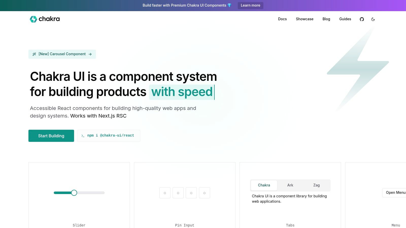
The library is built with WAI-ARIA standards in mind, ensuring that the components you use are accessible out of the box. For teams looking to accelerate development further, Chakra UI Pro offers professionally designed and coded component blocks and templates. This makes it an excellent choice for startups and teams that need to ship beautiful, functional, and accessible products quickly. Properly integrating such a library is a key decision, and understanding how to choose the right technology stack is crucial for long-term project success.
Key Details & Use Cases
| Aspect | Details |
|---|---|
| Best For | Rapid prototyping, MVPs, design systems, and projects where accessibility and developer experience are top priorities. |
| Strengths | Accessibility: Components are built with WAI-ARIA standards, providing excellent out-of-the-box accessibility. Developer Experience: Intuitive, prop-based styling makes development fast and enjoyable. Theming: A simple and powerful theming system allows for easy brand customization. Composition: Components are highly composable. |
| Limitations | Smaller Component Set: Has fewer complex, pre-built widgets (like data grids) compared to larger enterprise libraries. Pro Templates: The most advanced layouts and blocks are part of the paid Chakra UI Pro offering. |
| Pricing & License | Core library is free under the MIT License. Chakra UI Pro offers lifetime access to templates and blocks with a one-time payment, starting from $149 for individuals. |
Website: https://chakra-ui.com
4. Mantine: The Developer-Friendly All-Rounder
Mantine has quickly become a favorite within the React ecosystem, positioning itself as one of the best React component libraries for developers who prioritize usability and a seamless workflow. It is a full-featured, open-source library that comes packed with over 100 customizable components and more than 50 hooks. This extensive collection covers everything from basic inputs and buttons to complex modals and notifications, empowering developers to build fully functional web applications with speed and consistency.

The library's design philosophy is centered around an exceptional developer experience. It is built with TypeScript from the ground up, providing excellent type safety and autocompletion out of the box. Mantine also places a strong emphasis on accessibility and includes built-in dark theme support, making it easier to create inclusive and modern user interfaces. Its comprehensive and well-versioned documentation is another key highlight, making it incredibly easy for developers to get started and find solutions quickly.
Key Details & Use Cases
| Aspect | Details |
|---|---|
| Best For | Rapid application development, startups, internal tools, and projects where developer experience and a comprehensive set of free components are top priorities. |
| Strengths | Excellent DX: TypeScript-first design and incredible documentation make it a joy to work with. Comprehensive & Free: A massive set of high-quality components and hooks are available completely free. Accessibility-Focused: Strong adherence to WAI-ARIA standards and built-in theming. Extensive Hooks Library: Useful hooks for managing state and UI logic. |
| Limitations | Smaller Ecosystem: Lacks the extensive third-party templates and commercial add-ons seen with giants like MUI. Fewer Enterprise Components: Does not offer highly complex, specialized components like advanced data grids out of the box. |
| Pricing & License | Completely free and open-source under the MIT License. |
Website: https://mantine.dev
5. Radix UI: The Foundation for Custom Design Systems
Radix UI takes a fundamentally different approach compared to other libraries on this list. Instead of providing pre-styled components, it offers a collection of unstyled, fully accessible, and highly composable primitives. This makes it one of the best React component libraries for teams that want complete control over their design and need a solid, accessible foundation to build upon, rather than adopting an existing design system.
The library excels at handling complex UI logic like popovers, dropdowns, and dialogs, managing all the state, interactions, and WAI-ARIA accessibility patterns for you. This frees developers to focus purely on styling. For teams who want a faster start, Radix also offers Radix Themes, an optional, opinionated styling layer built on top of the primitives. Because these components are headless and lightweight, they are an excellent choice for projects where you need to improve website performance and avoid the overhead of large, all-in-one libraries.
Key Details & Use Cases
| Aspect | Details |
|---|---|
| Best For | Teams building a bespoke design system from scratch, projects with unique branding requirements, and developers who prioritize accessibility and full styling control. |
| Strengths | Maximum Styling Control: Completely unstyled primitives give you total freedom over the look and feel. Accessibility First: Built with WAI-ARIA standards from the ground up, ensuring excellent keyboard and screen reader support. Composable: Primitives are designed to be composed together to create complex components. Lightweight: Minimal performance footprint as you only use what you need. |
| Limitations | Styling Required: Every component must be styled manually, which can increase initial development time. Smaller Component Set: Focuses on foundational primitives rather than a massive catalog of complex, ready-to-use components. |
| Pricing & License | Completely free and open-source under the MIT License. |
Website: https://www.radix-ui.com
6. PrimeReact: The Versatile All-in-One Toolkit
PrimeReact offers a comprehensive and versatile suite of over 90 open-source components, making it a strong contender among the best React component libraries for developers who need a wide array of UI elements out of the box. Its key advantage is the balance it strikes between a rich feature set and rapid development, supported by an ecosystem of optional, premium assets.
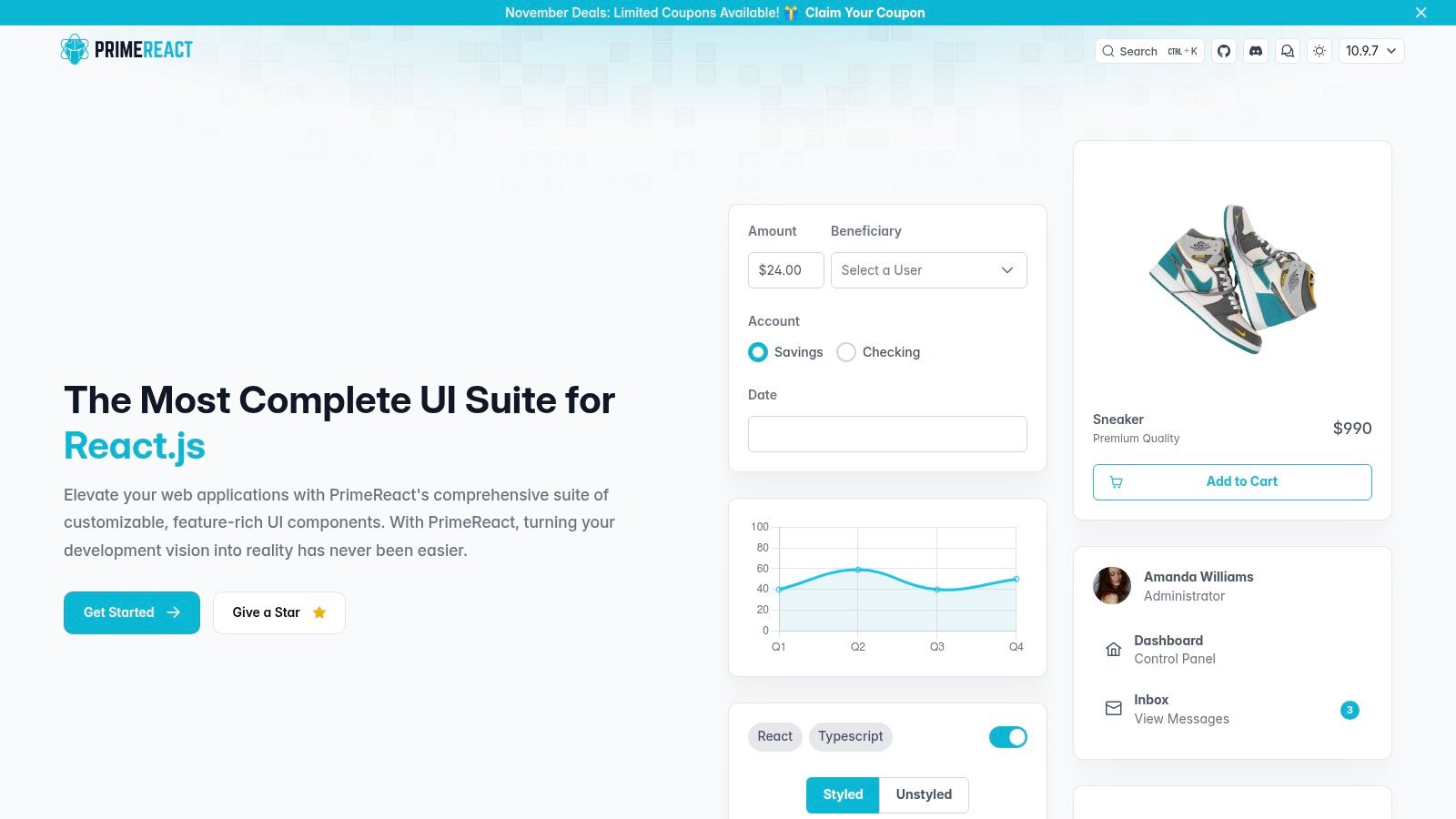
While the core library is free, PrimeReact accelerates project delivery through its marketplace of professionally designed templates and a separately sold Figma UI Kit. This model allows teams to start with a powerful free library and invest in tools that significantly reduce design and development time. This makes it an excellent choice for projects where speed to market is a critical factor without sacrificing component variety or functionality.
Key Details & Use Cases
| Aspect | Details |
|---|---|
| Best For | Rapid prototyping, building internal tools, SaaS applications, and projects that can benefit from pre-built premium templates. |
| Strengths | Massive Component Library: Over 90 components, covering nearly every common UI need. Theming System: Flexible theming architecture with several free themes and a visual editor. Templates & UI Kits: Premium templates and a Figma UI Kit can dramatically speed up development. Active Maintenance: Frequent updates and a responsive community ensure the library stays current. |
| Limitations | Premium Assets: Key accelerators like the Figma UI Kit and premium templates are paid add-ons. Design Customization: The default visual style is distinct and may require significant theming to align with a unique brand identity. |
| Pricing & License | Core components are free under the MIT License. Premium templates and the Figma UI Kit are sold separately with their own commercial licenses. |
Website: https://primereact.org
7. KendoReact (Telerik)
KendoReact is a premium, enterprise-grade React component suite from Telerik designed for building complex business applications. It provides a comprehensive library of over 120 professionally built, feature-rich components that are optimized for performance and reliability. Unlike many open-source alternatives, KendoReact is a commercial product backed by dedicated professional support and service-level agreements (SLAs), making it a secure choice for mission-critical projects.

The library excels in providing sophisticated components essential for data-intensive applications, such as powerful data grids, schedulers, charts, and editors. KendoReact also offers extensive theming capabilities, including a ThemeBuilder tool and Figma UI Kits, to ensure components align perfectly with brand guidelines. With its focus on enterprise needs, it stands out as one of the best React component libraries for teams that require guaranteed support and mature, out-of-the-box functionality for complex internal tools and SaaS platforms.
Key Details & Use Cases
| Aspect | Details |
|---|---|
| Best For | Large-scale enterprise systems, internal business applications, data visualization dashboards, and projects requiring guaranteed vendor support and SLAs. |
| Strengths | Mature Business Components: Industry-leading data grids, schedulers, and charts ready for complex scenarios. Professional Support: Access to dedicated support teams with guaranteed response times. Extensive Theming: Includes a ThemeBuilder, Figma kits, and professionally designed themes. Accessibility: Strong commitment to accessibility (Section 508, WCAG 2.1). |
| Limitations | Commercial License: Requires a paid license per developer, which can be a significant cost for larger teams. Bundle Size: The comprehensive nature of the components can lead to a larger bundle size compared to more minimal or headless libraries. |
| Pricing & License | Commercial license required. Pricing starts at $999 per developer for a one-year subscription, which includes support and updates. |
Website: https://www.telerik.com/kendo-react-ui
8. Syncfusion Essential Studio for React
Syncfusion Essential Studio for React is a comprehensive commercial library designed for building line-of-business and enterprise-scale applications. It distinguishes itself with an exceptionally broad catalog of over 80 components, covering everything from complex data grids and charts to specialized UI elements like schedulers, file managers, and word processors. This extensive coverage makes it a strong contender among the best react component libraries for teams needing a one-stop solution.
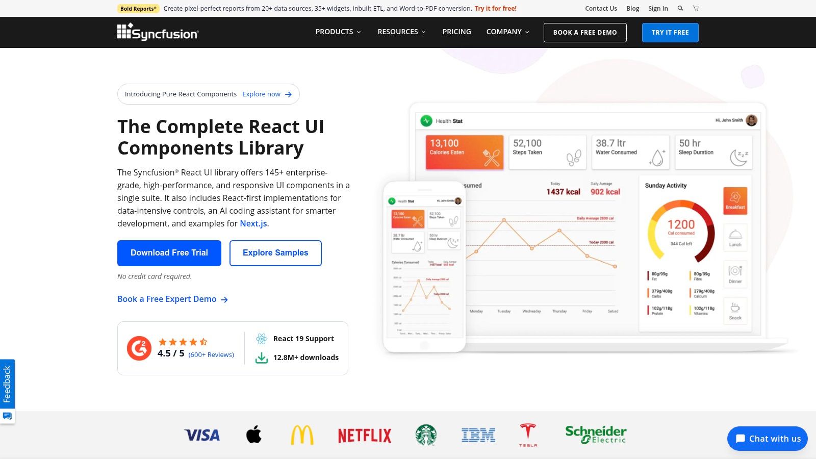
The library emphasizes performance and provides extensive documentation and interactive demos to help developers get started quickly. Its licensing model is particularly noteworthy; it includes a generous Community License that provides free access for individual developers and small businesses with less than $1 million USD in annual revenue. This allows smaller teams to leverage enterprise-grade components without the initial investment, making it a powerful and accessible choice.
Key Details & Use Cases
| Aspect | Details |
|---|---|
| Best For | Enterprise resource planning (ERP) systems, financial dashboards, healthcare applications, and complex internal business tools requiring a wide variety of specialized UI controls. |
| Strengths | Massive Component Library: One of the most extensive collections available, covering data visualization, editing, and scheduling. Community License: Free for eligible small organizations and individual developers. Excellent Support: Known for its responsive and helpful customer support. Extensive Demos: A large gallery of examples for every component. |
| Limitations | Commercial Focus: The full suite requires a paid license for larger organizations. Verbose APIs: Some component APIs can be more verbose compared to more minimalist libraries. Documentation Variance: The depth of documentation can vary between components. |
| Pricing & License | Free Community License for qualifying individuals and small businesses. Commercial licenses are required for larger companies, with pricing based on a per-developer model. |
Website: https://www.syncfusion.com/react-components
9. React-Bootstrap: The Classic Grid System Reimagined
React-Bootstrap stands as one of the oldest and most dependable React component libraries, offering a complete reimplementation of Bootstrap components. It replaces the original Bootstrap JavaScript with pure React components, eliminating dependencies like jQuery. This makes it a natural fit for developers who are already familiar with Bootstrap's grid system and design philosophy but want a more integrated React experience.
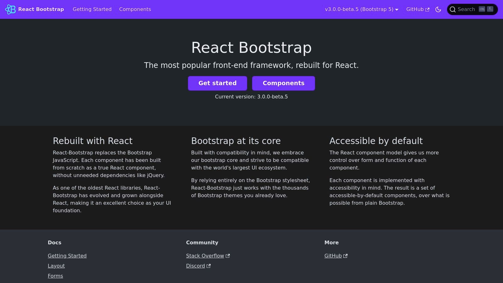
The library's main appeal is its stability and predictability. By leveraging the standard Bootstrap stylesheet, developers gain access to a massive ecosystem of themes and templates, enabling rapid prototyping and consistent design. Each component is built with accessibility in mind, providing a solid foundation for creating inclusive web applications without extensive manual configuration.
Key Details & Use Cases
| Aspect | Details |
|---|---|
| Best For | Developers transitioning from Bootstrap, projects needing a robust and responsive grid system, and applications where leveraging existing Bootstrap themes is a priority. |
| Strengths | Familiarity: Easy learning curve for anyone with Bootstrap experience. Huge Ecosystem: Compatible with the vast number of Bootstrap themes and templates available. No jQuery: Pure React components for better performance and compatibility. Stability: A mature and well-maintained library with clear migration paths. |
| Limitations | Styling: Requires theming or custom CSS to create a unique visual identity distinct from the default Bootstrap look. Fewer Advanced Components: Lacks the complex, data-centric components found in enterprise-focused libraries like MUI or Ant Design. |
| Pricing & License | Completely free and open-source under the MIT License. |
Website: https://react-bootstrap.github.io
10. Headless UI: The Unstyled, Accessible Foundation
For developers who demand complete control over styling, Headless UI offers a different approach to building UIs. Created by the team behind Tailwind CSS, it provides a set of completely unstyled, fully accessible UI components. This library handles all the complex logic, state management, and accessibility requirements for components like dialogs, menus, and listboxes, leaving you free to implement any design you can imagine.
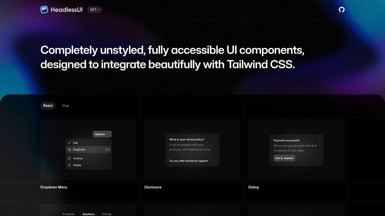
Unlike other best React component libraries that come with predefined styles, Headless UI is a "bring your own styles" solution. It pairs perfectly with utility-first CSS frameworks like Tailwind CSS but works equally well with any styling method. This makes it an ideal choice for projects with a unique, bespoke design system where pre-styled components would only get in the way. It empowers you to build beautiful, custom interfaces without ever having to fight with or override default library styles.
Key Details & Use Cases
| Aspect | Details |
|---|---|
| Best For | Custom design systems, projects using Tailwind CSS, and developers who want full stylistic control without sacrificing accessibility. |
| Strengths | Total Styling Freedom: Components are completely unstyled, allowing for 100% custom designs. Accessibility-First: Built with WAI-ARIA standards, ensuring excellent keyboard navigation and screen reader support out of the box. Seamless Integration: Designed to work perfectly with Tailwind CSS and other styling solutions. |
| Limitations | Requires All Styling: You are responsible for writing every single line of CSS, which can increase initial development time. Smaller Component Set: Focuses on foundational interactive components rather than a comprehensive UI kit. |
| Pricing & License | Completely free and open-source under the MIT License. |
Website: https://headlessui.com
11. React Spectrum / React Aria (Adobe): The Accessibility-First Framework
React Spectrum and React Aria are Adobe’s open-source contributions to the world of accessible, adaptive, and internationalized component development. React Spectrum is a complete, styled component library based on Adobe's design system, while React Aria provides the unstyled, accessible hooks and primitives. This dual offering makes it one of the best React component libraries for teams that prioritize accessibility and flexibility.

This powerful combination allows developers to either adopt Adobe's mature design system out of the box or build a completely custom design system on a foundation of best-in-class accessibility and interaction logic. The library excels at handling complex user interactions across all devices, from mouse and keyboard to touch and screen readers, ensuring a consistent and inclusive user experience for a global audience. For teams looking to build a truly inclusive application, integrating this framework with professional React development services can ensure accessibility standards are met from the ground up.
Key Details & Use Cases
| Aspect | Details |
|---|---|
| Best For | Applications requiring WCAG compliance, global products needing strong internationalization (i18n) and RTL support, and teams building a custom design system that want to leverage headless, accessible primitives. |
| Strengths | Accessibility-First: Unmatched focus on ARIA patterns, screen reader support, and keyboard navigation. Headless Primitives: React Aria offers unstyled hooks for maximum design flexibility. Internationalization: Built-in support for over 30 languages, RTL layouts, and localized formatting. Device Agnostic: Handles interactions consistently across pointer, touch, and keyboard inputs. |
| Limitations | Opinionated Design: React Spectrum's visual style is distinctly Adobe's, which may require significant theming to align with other brands. Smaller Ecosystem: Has a less extensive third-party ecosystem for themes and templates compared to giants like MUI. |
| Pricing & License | Completely free and open-source under the Apache 2.0 License. |
Website: https://react-spectrum.adobe.com
12. Fluent UI React (Microsoft)
Fluent UI React is the official open-source component library from Microsoft, designed to bring the principles of Fluent Design to web applications. It's the ideal choice for developers building products that need to align with the look and feel of Microsoft's ecosystem, such as Office 365 or Azure. The library provides a robust set of accessible, performant, and customizable components that ensure a consistent user experience.
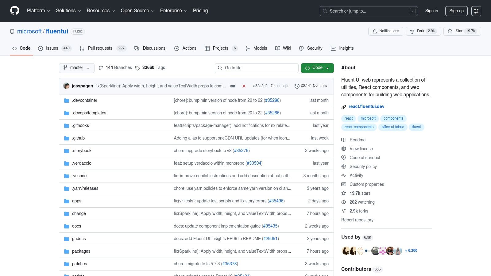
Its primary strength comes from the long-term stewardship of Microsoft, guaranteeing ongoing maintenance and adherence to enterprise-grade standards for accessibility and internationalization. The latest version (v9) focuses on a modern architecture using web components and design tokens for greater performance and flexibility. This makes it a reliable and future-proof option among the best React component libraries for enterprise environments.
Key Details & Use Cases
| Aspect | Details |
|---|---|
| Best For | Enterprise applications, internal business tools, apps integrating with Microsoft products (Office, Teams, Azure), and projects where a familiar, corporate design language is a priority. |
| Strengths | Microsoft Ecosystem Alignment: Provides a native look and feel for apps intended to run alongside Microsoft software. Excellent Accessibility: Built with accessibility (a11y) as a core principle. Vendor Backing: Maintained and supported by Microsoft, ensuring long-term stability. Performance: Version 9 offers significant performance improvements. |
| Limitations | Opinionated Design: The visual identity is strongly tied to Fluent Design, which may not suit all brand aesthetics. Version Migration: The shift from v8 to the completely rewritten v9 can present a migration challenge for existing projects. |
| Pricing & License | Free and open-source under the MIT License. |
Website: https://github.com/microsoft/fluentui
Top 12 React Component Libraries — Feature Comparison
| Library | ✨ Core / Notable features | ★ UX / Quality | 💰 Pricing / Value | 👥 Best for | 🏆 Standout USP |
|---|---|---|---|---|---|
| MUI | Material core (MIT); MUI X: DataGrid, Charts, Pickers | ★★★★☆ — mature docs & ecosystem | 💰 Core free; MUI X & support paid | 👥 Enterprises & dashboards | 🏆 Enterprise-grade data grid & deep theming |
| Ant Design | TypeScript-first components, forms, tables, i18n, theming | ★★★★☆ — polished, consistent patterns | 💰 OSS core; enterprise support options | 👥 Data-dense enterprise apps | 🏆 Powerful table/form systems |
| Chakra UI | Accessibility-first primitives, design tokens, Pro templates | ★★★★☆ — fast prototyping & A11y defaults | 💰 Core free; Pro templates paid | 👥 Startups & accessibility-focused teams | 🏆 Ergonomic API + accessibility |
| Mantine | Wide components & hooks, TS-first, dark mode, versioned docs | ★★★★☆ — excellent developer experience | 💰 MIT free; smaller commercial ecosystem | 👥 Dev teams wanting DX & full UI coverage | 🏆 Broad component set with great DX |
| Radix UI | Unstyled accessible primitives (headless), composable APIs | ★★★★☆ — excellent A11y, headless control | 💰 Free OSS; styling required | 👥 Design-system teams wanting full control | 🏆 Maximum styling control + accessibility |
| PrimeReact | Many components, templates, marketplace; paid UI kits | ★★★★☆ — good breadth, template-driven speed | 💰 Core free; templates & Figma kit paid | 👥 Teams needing fast time‑to‑market | 🏆 Templates & marketplace to accelerate delivery |
| KendoReact (Telerik) | 120+ premium components, grids, ThemeBuilder, SLAs | ★★★★☆ — enterprise-grade stability | 💰 Commercial per-developer licensing | 👥 Large enterprises requiring vendor support | 🏆 Mature business components & support tiers |
| Syncfusion | Extensive visualization, editors, schedulers; demos | ★★★★☆ — broad coverage, many samples | 💰 Commercial; Community License for small orgs | 👥 Enterprises needing comprehensive UI sets | 🏆 Massive component catalog + Community License |
| React-Bootstrap | Bootstrap 5 components in React; Bootstrap stylesheet | ★★★☆☆ — familiar look, wide theme ecosystem | 💰 Free OSS; third-party themes often paid | 👥 Teams wanting Bootstrap design + React | 🏆 Bootstrap compatibility & responsive grid |
| Headless UI | Unstyled accessible components, Tailwind-friendly APIs | ★★★☆☆ — lightweight, great keyboard support | 💰 Free OSS | 👥 Tailwind users & projects needing styling control | 🏆 Tight Tailwind pairing & simple primitives |
| React Spectrum / Aria | Styled Spectrum + Aria primitives; i18n & RTL support | ★★★★☆ — excellent accessibility & adaptability | 💰 Free (Apache 2.0) | 👥 Apps needing strong A11y & internationalization | 🏆 End‑to‑end accessibility & device-agnostic interactions |
| Fluent UI React | Fluent Design components & web components, design tokens | ★★★★☆ — consistent enterprise patterns | 💰 Free OSS (Microsoft-backed) | 👥 Microsoft ecosystem & enterprise apps | 🏆 Fluent Design alignment & long-term stewardship |
Making Your Final Choice & How We Can Help
Navigating the landscape of the best React component libraries can feel overwhelming, but making an informed decision is a critical step that sets the foundation for your application's future. As we've explored, the "best" library is not a one-size-fits-all title. Instead, it's the one that most closely aligns with your project's specific goals, team skills, and design requirements.
The choice you make has long-term implications for everything from developer productivity and bundle size to accessibility compliance and long-term maintainability. Rushing this decision can lead to technical debt, performance bottlenecks, or a frustrating developer experience down the line.
Key Takeaways for Your Decision
To simplify your choice, let's distill the core insights from our analysis. Your final decision should balance your need for speed, customization, and long-term stability.
- Styled vs. Headless: This is the primary fork in the road. Do you need a comprehensive, out-of-the-box UI kit like MUI or Ant Design to build fast? Or do you require the complete stylistic freedom of a headless library like Radix UI or Headless UI to match a bespoke brand identity?
- Developer Experience (DX) Matters: Libraries like Chakra UI and Mantine prioritize an intuitive and enjoyable development process. A strong DX directly translates to faster feature development and easier onboarding for new team members, which is a significant business advantage.
- Performance is Not an Afterthought: Pay close attention to bundle size and tree-shaking capabilities. While a large library might seem convenient, its impact on your application's initial load time can affect user experience and SEO. Always analyze the performance cost.
- Ecosystem and Community: A vibrant community, excellent documentation, and a healthy maintenance schedule (check GitHub for recent commits and open issues) are signs of a reliable library. This support system is invaluable when you encounter inevitable roadblocks.
A Quick Guide to Choosing Your Library
If you're still weighing your options, use these scenarios as a starting point. Think of this as a strategic cheat sheet to narrow down the vast field of the best React component libraries.
- You're building a data-intensive enterprise dashboard: Your priorities are a vast component set, robust data grids, and proven stability.
- Top Choices: MUI, Ant Design, KendoReact. These offer the power and complexity needed for enterprise-grade applications.
- You're a startup launching an MVP quickly: You need speed, excellent developer experience, and a good-looking default theme that you can easily customize.
- Top Choices: Chakra UI, Mantine. Their intuitive APIs and thoughtful design will help you get to market faster.
- You have a dedicated design team and a unique brand identity: You cannot be constrained by a library's default styles. Your priority is 100% design control and accessibility.
- Top Choices: Radix UI, Headless UI, React Aria. These provide the unstyled, accessible primitives you need to build a truly custom design system from the ground up.
- Your team is familiar with Bootstrap and wants to modernize: You need a gentle learning curve and want to leverage existing CSS knowledge.
- Top Choice: React-Bootstrap. It's the most direct path to bringing a legacy Bootstrap project into the React ecosystem.
Making the right choice is more than a technical decision; it's a strategic one that impacts your budget, timeline, and final product. It requires a clear understanding of your project's roadmap and your team's capabilities. With the right foundation, you empower your team to build a scalable, high-performance, and beautiful application that delights users and achieves your business objectives.
Feeling overwhelmed by the options or need an expert hand to ensure you make the right choice? At 42 Coffee Cups, we specialize in transforming complex technical decisions into successful, high-performance web applications. Let our seasoned React experts help you select, integrate, or even build a custom component library that accelerates your development and sets your project up for long-term success.