How to Optimize Images for Web Performance and SEO
Learn how to optimize images for web performance and SEO. Discover proven techniques for image compression, formatting, and delivery to speed up your website.

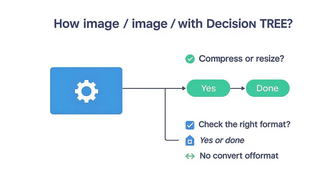
When you get right down to it, optimizing images for the web is a balancing act. It's all about three things: choosing the right format, using smart compression, and resizing images to the precise dimensions they'll be displayed at. If you can get these three principles right, you'll slash your file sizes, speed up your website, and make for a much better user experience—all without sacrificing visual quality.
Why Image Optimization Matters More Than Ever
In a world where attention spans are measured in seconds, your website's performance isn't just a "nice-to-have." It’s a core part of the user experience. I've seen it time and time again: large, clunky images are almost always the biggest culprit behind slow page loads. This directly leads to frustrated visitors and people bouncing right off your site.
When a page lags, potential customers or readers are gone before your content even gets a chance to make an impression. This has a ripple effect. A slow website doesn't just erode user trust; it actively hurts your search engine rankings. Google is very clear about using page speed and Core Web Vitals as ranking factors, which means those unoptimized images can literally make your site invisible to the people you’re trying to reach.
The Impact on User Engagement and SEO
There's no denying the connection between good visuals and how people interact with your content. The data backs this up—research has shown that content featuring well-optimized images can pull in about 94% more views than content without any. This really drives home a critical point: you need images to stand out, but they absolutely have to be performance-friendly.
This is where the real work of image optimization comes in. It's not just about shrinking files. It’s about fundamentally improving how a person interacts with your site from the moment they land on it.
By focusing on image optimization, you are directly investing in a better user experience. A faster, more responsive site keeps users engaged, encourages them to explore further, and signals quality to search engines.
Core Principles for Success
Ultimately, a winning strategy comes down to a few key areas, which we'll break down in this guide. For a deeper dive into the fundamental strategies and benefits, you can explore detailed guides on how to optimize images for web performance.
The main goals are to:
- Reduce Page Weight: Smaller image files mean less data for the browser to download. The result? Faster load times.
- Improve Core Web Vitals: Optimized images directly help you score better on key metrics like Largest Contentful Paint (LCP), which Google watches closely.
- Enhance User Experience: A snappy, quick-loading site just feels more professional and is way more enjoyable to browse. This is a cornerstone of good user experience design fundamentals.
To make this even clearer, here’s a quick overview of what we're aiming for.
Quick Guide to Web Image Optimization
This table sums up the core actions and their benefits at a glance, giving you a simple roadmap for every image you add to your site.
| Optimization Area | Key Action | Primary Benefit |
|---|---|---|
| File Format | Choose WebP or AVIF for modern browsers; JPEG for photos; PNG for transparency. | Balances quality with the smallest possible file size for the job. |
| Compression | Apply lossy or lossless compression to reduce file size without major quality loss. | Significantly speeds up page load times by reducing data transfer. |
| Dimensions | Resize images to the exact dimensions they will be displayed at on the site. | Prevents the browser from wasting resources downloading and resizing oversized images. |
| Responsiveness | Use the <picture> element or srcset attribute to serve different sizes for different screens. | Ensures a fast experience on all devices, from mobile to desktop. |
| Lazy Loading | Defer loading of off-screen images until the user scrolls them into view. | Improves initial page load speed and saves bandwidth. |
By keeping these points in mind, you're not just making technical tweaks; you're building a better, faster, and more engaging experience for every single visitor.
Choosing the Right Image Format for the Job
Before you even think about compression or resizing, your first move in image optimization is picking the right format. This is one of those foundational decisions that can make or break your page speed. It's not about finding a single "best" format—it’s about understanding what each one does best and matching it to the image in front of you.
Getting this wrong means you’re either stuck with a massive file that slows everything down or a blurry image that looks unprofessional. Let's break down the main players so you can make the right call every time.
The Classic Contenders: JPEG and PNG
For a long time, JPEG and PNG were pretty much all we had. They're still incredibly useful, but you need to know when to use them.
-
JPEG (or JPG): This is your workhorse for anything with a lot of colors and detail, like photographs. JPEGs use "lossy" compression, which is a clever way of throwing out tiny bits of data the human eye won't miss. The result is a much smaller file that still looks great. For a hero image or a product shot, JPEG is often the perfect fit.
-
PNG: Reach for a PNG when you need a transparent background or your image has sharp lines and flat colors. Think logos, icons, and diagrams. PNGs use "lossless" compression, meaning they keep every single pixel intact. This precision comes at a cost—larger file sizes—but it's essential when quality and transparency are non-negotiable.
Next-Gen Formats: WebP and AVIF
The web has evolved, and so have image formats. Modern options like WebP and AVIF were built from the ground up for performance, offering a huge advantage over their older cousins.
Switching to a modern format like WebP is one of the quickest wins you can get. The file size savings directly translate to faster load times and a better score on your Core Web Vitals.
WebP, created by Google, is the new standard for a reason. It's a fantastic all-rounder that supports both lossy and lossless compression, transparency, and even animation. On average, WebP images are 25-34% smaller than a comparable JPEG and 26% smaller than a PNG. Those numbers come straight from Google's own data on WebP's efficiency.
AVIF is the newer kid on the block, often delivering even more impressive file size reductions than WebP. However, its browser support isn't quite as universal yet.
For most projects today, WebP hits the sweet spot between cutting-edge performance and reliable browser compatibility. Making it your default format is one of the smartest decisions you can make.
To help you decide, here's a quick comparison of the most common formats you'll encounter.
Image Format Comparison for Web Use
| Format | Best For | Key Features | Size Efficiency |
|---|---|---|---|
| JPEG | Photographs, complex images, gradients | Lossy compression, no transparency, widely supported | Good for photos, but larger than modern formats |
| PNG | Logos, icons, graphics with transparency | Lossless compression, supports transparency, high quality | Larger files, especially for complex images |
| WebP | All-purpose (photos, graphics, logos) | Lossy & lossless compression, transparency, animation | Excellent—25-34% smaller than JPEG on average |
| AVIF | All-purpose (especially high-detail images) | Superior lossy & lossless compression, transparency, HDR | Best-in-class, but browser support is still growing |
| SVG | Logos, icons, simple illustrations | Vector-based (scalable), small file size, editable with code | Extremely high, as it's not pixel-based |
Ultimately, the goal is to use this knowledge to serve the smallest possible file that still looks fantastic. Starting with the right format sets you on the right path from the very beginning.
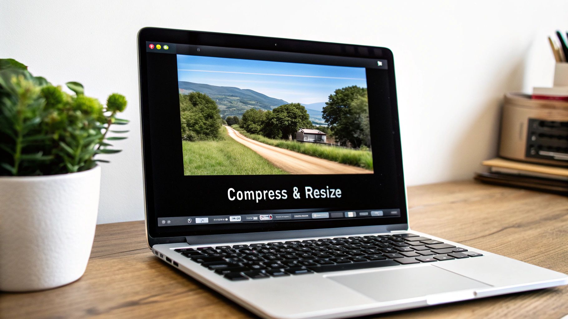
Mastering Image Compression and Resizing
Picking the right format is a great start, but the real magic for page speed happens with compression and resizing. This is where you can absolutely slash your file sizes, turning a clunky, slow-loading page into something that feels zippy and responsive. If you're serious about web performance, this is a skill you have to nail.
At its heart, compression is all about making an image's file size smaller. It really comes down to two flavors: lossy and lossless. Getting your head around the difference is crucial for making the right call.
Lossless vs. Lossy Compression
Think of lossless compression like a perfectly packed suitcase. You’ve fit everything into a smaller space without throwing anything away. When you "unpack" the image by opening it, every single pixel is exactly as it was. This is perfect for logos, icons, and technical diagrams where sharp lines and perfect detail are non-negotiable.
Lossy compression, on the other hand, is a bit more aggressive. It cleverly throws out tiny bits of data that the human eye isn't likely to miss. This results in a massive reduction in file size, but you do permanently lose a little bit of quality—though it's often impossible to spot. For almost all photographs, this is the way to go. The file size savings are just too good to pass up.
The goal isn't to crush an image down to its last byte. It's about finding that sweet spot—the smallest possible file size with no noticeable drop in quality. That’s where your website really starts to fly.
Smart Tools for the Job
Manually fiddling with compression settings is a pain. Luckily, there are some fantastic, user-friendly tools that make finding this balance incredibly simple.
I find myself constantly coming back to two of them: TinyPNG and Squoosh.
- TinyPNG: Don't let the name fool you; it works wonders on JPEGs and WebPs, too. It’s a dead-simple drag-and-drop tool that uses smart lossy compression algorithms to shrink your files, often by more than 70%. It's my go-to for a quick and powerful fix.
- Squoosh: Built by Google's team, Squoosh is an amazing in-browser tool that gives you a live, side-by-side comparison of your original and optimized image. You can play with different formats and tweak compression levels in real-time, watching how the quality and file size change as you move the sliders.
Here’s a look at the Squoosh interface. That real-time preview is a game-changer.
The split-screen view is just invaluable. You can see with your own eyes that your compression settings aren't destroying the image quality, all while watching the file size plummet.
Why You Can't Skip Resizing
Finally, let's talk about resizing. It’s a simple concept, but it's one of the most common performance mistakes I see. People will upload a massive, 4000-pixel-wide photo straight from a camera and stick it in a space that’s only 600 pixels wide on the page.
When that happens, the user’s browser has to download the entire multi-megabyte file and then shrink it to fit. It's a huge waste of bandwidth and time.
Make this a golden rule: Always resize your images to their final display dimensions before you upload them. If your blog content area is 800 pixels wide, there's absolutely no reason to use an image that's wider than that. This one change can take a file from several megabytes down to well under 100 kilobytes.
If you want to go deeper on this, check out this excellent guide to sizing images for websites for some more advanced techniques.
Boosting Performance with Responsive Images and Lazy Loading
If you’re still optimizing images for a single screen size, you’re stuck in the past. These days, people browse on everything from tiny phones to massive monitors, so a one-size-fits-all image strategy is a recipe for a slow, clunky website. To really get a handle on image optimization, you have to think responsively.
This is all about serving up the right image resolution for the right screen. It just doesn't make sense for someone on a small phone to burn through their data downloading a huge image meant for a 4K desktop monitor. That's where responsive images save the day.
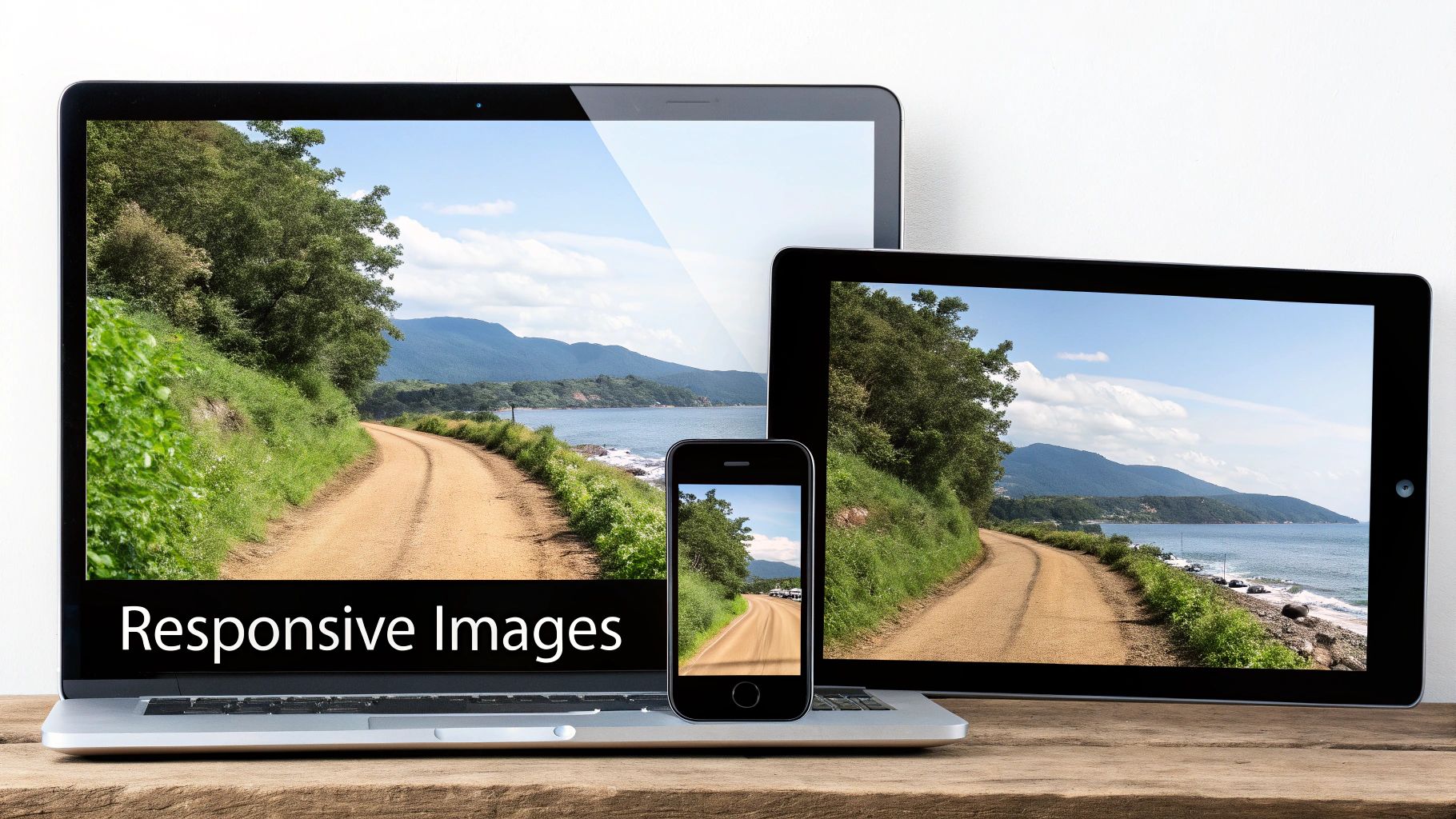
Serving the Right Image with Srcset and Sizes
Instead of a plain old <img> tag, you can give the browser a whole menu of image options using the srcset and sizes attributes. This empowers the browser to be smart and pick the perfect file based on the user's viewport and screen resolution.
-
The
srcsetAttribute: Think of this as your list of available images. You provide a comma-separated list of image files along with their actual widths. For example:image-small.jpg 480w, image-medium.jpg 800w. -
The
sizesAttribute: This attribute is your instruction manual for the browser. It tells it how wide the image will actually be displayed at different screen sizes. For instance,(max-width: 600px) 480px, 800pxtells the browser, "if the screen is 600px or less, the image will be 480px wide; otherwise, it'll be 800px wide."
Armed with this info, the browser does the math and grabs the best-fit image from your srcset list. Mobile users get a small, fast-loading image, while desktop users get the crisp, high-quality version they expect.
Implementing
srcsetandsizesisn't just a nice-to-have anymore; it's a core practice for modern web performance. It's a direct upgrade to the user experience on mobile and gives your Core Web Vitals a real boost.
The Power of Lazy Loading
Another game-changer is lazy loading. This simple but powerful technique tells the browser not to load images that are off-screen until the user actually scrolls near them. Think about it: why should a browser waste time and data loading a footer image the second someone lands on your homepage?
Getting this set up is surprisingly easy in modern browsers. Just add the loading="lazy" attribute to your <img> tag. That’s it. You're telling the browser to hold off on downloading that image until it's about to scroll into view.
This one small tweak can have a huge impact. For sites with a lot of images, native lazy-loading can slash up to 500KB or more from the initial page load. It's a simple, powerful attribute that's now supported everywhere and is a must-use for performance. You can read more about the lazy loading's effect on Core Web Vitals on web.dev.
When you combine responsive images with lazy loading, you get a one-two punch that dramatically cuts down initial page load times—a huge win for keeping users around and for your SEO. These techniques are absolutely essential if you want to improve website loading speed and give your visitors a great experience.
Automating Your Image Optimization Workflow
Let's be real: manually optimizing every single image is a recipe for burnout. As your site scales, it quickly becomes impossible to keep up. The only way to win the web performance game long-term is to build optimization right into your workflow. That's where automation comes in.
For a lot of people, especially if you're on a platform like WordPress, this means leaning on a good plugin. Tools like Smush, ShortPixel, or EWWW Image Optimizer are popular for a reason—they do all the tedious work for you. You just upload an image, and the plugin takes over, automatically compressing, resizing, and even converting it to a modern format like WebP. It's a true "set it and forget it" solution.
Automation for Developers
If you're a developer, your automation options get even more interesting. Modern build tools and frameworks have pretty much solved this problem. You can configure your Vite or webpack setup with plugins that automatically process every image asset when you build your project.
Image CDNs take things to another level entirely. Services like Cloudinary or Imgix let you upload one high-resolution master image. From there, you can request that image in any size, format, or quality you need just by tweaking the URL. This is a game-changer because it takes all the processing off your server and makes generating responsive variants completely automatic.
Automation isn't about being lazy; it's about being consistent. When optimization is a default part of your workflow, you guarantee a fast experience for every user without drowning in repetitive manual tasks.
Framework-Driven Optimization with Next.js
Modern web frameworks are leaning heavily into this automated approach. Take Next.js, for example. Its built-in <Image> component is a powerhouse for performance.
It automates almost everything you'd normally have to do by hand: resizing, format conversion (like serving AVIF or WebP), and lazy loading. This isn't a minor tweak; this component can slash typical image payloads by over 60% with almost no extra work. You can dive into the specifics in the official Next.js Image component documentation.
The framework handles the nitty-gritty of creating multiple image sizes and picking the perfect one for each user's device. For anyone building a high-performance site, using these built-in tools is a massive win. And if you're building with this stack, looking into professional Next.js development services can ensure you're getting the most out of these powerful, performance-first features.
By embracing these kinds of automated solutions, you stop fixing performance problems and start building a site that is incredibly fast by default.
Answering Your Top Image Optimization Questions
Once you get the hang of formats and compression, you'll inevitably run into some real-world questions. I get these all the time. Let's walk through the most common ones that tend to trip people up, so you can turn a good optimization strategy into a great one.
People often get hung up on hitting a specific number, but it's really more of an art than a science. The goal is always to strike the right balance for each and every image.
What Is the Ideal File Size for a Web Image?
This is the million-dollar question, but the honest answer is: it depends. There's no single magic number, since an image's role and dimensions matter a lot.
As a practical rule of thumb, I always aim to get large, full-width hero images under 200 KB. For the smaller images sprinkled throughout your content, keeping them under 100 KB is a fantastic target.
The real goal is to shrink the file as much as you can before you start seeing a noticeable drop in quality. Fire up a tool like Squoosh and play with the settings—you'll quickly get a feel for that perfect balance point where the image still looks crisp but the file size is tiny.
Does Image Optimization Really Affect My SEO?
You bet it does. Page speed is a huge ranking factor for Google, and heavy, unoptimized images are one of the most common culprits behind slow-loading sites. A faster website creates a better user experience, which often translates to lower bounce rates and a nice little bump in your search rankings.
It's not just about speed, though. Using descriptive file names (e.g.,
modern-kitchen-with-island.jpginstead ofIMG_1234.jpg) and writing helpful alt text gives search engines crucial context. This simple step can boost your visibility in both standard and image search results. It’s a classic win-win.
Can I Use WebP for All My Images Now?
Pretty much, yes! WebP has come a long way and now enjoys fantastic support across all major modern browsers—Chrome, Firefox, Edge, and even Safari are all on board. For the vast majority of your audience, making WebP your go-to format is a no-brainer for better performance.
What about that small fraction of users on ancient browsers? You've still got them covered. The HTML <picture> element is your best friend here. It lets you provide a WebP version first, with a JPEG or PNG as a fallback. It’s a clean, simple way to ensure everyone sees an image, no matter what browser they’re using.
Ready to build a high-performance web application that’s optimized from the ground up? At 42 Coffee Cups, we specialize in creating fast, scalable solutions using Next.js and Python/Django. Let's build something amazing together.